The Psychology Behind Make-up Packaging Design
How Visual Design Influences Consumer Emotions
Packaging design holds a key role in shaping consumer actions in the beauty field. Experts choose colors, shapes, and fonts carefully. These elements connect directly to how people feel. For example, gentle pinks hint at femininity and warmth. Black signals elegance and high-end appeal. Bright reds stir up energy and strength. Brands pick these shades to match their audience and product image.
Shapes and outlines in make-up packaging affect how buyers see things too. Soft curves can feel welcoming and easygoing. Sharp edges and straight lines often show accuracy or fresh ideas. Fonts add more detail to this message. Strong sans-serif styles fit bold or current brands. Graceful serif letters suggest classic elegance.
The packaging world has shifted from simple usefulness to deep emotional ties. Companies use clever designs, touch sensations, and fun interactions. They turn packaging into a strong link between brands and customers. This meets buyers’ wants for beauty and feelings at once.
Such emotional packaging boosts first looks. It also builds bonds that lead to steady loyalty and more buys. Brands that spark feelings through design create long-term ties with users.
The Role of First Impressions in Purchase Decisions
In cosmetics, packaging offers the first real touch with the brand. Users see the outer look before trying the item. This design shares the brand’s core ideas and quality hints. Eye-catching packaging raises the sense of worth a lot. Shoppers often link pretty wrappers to better product results.
The packaging sector shows four main traits. These include stronger eco-focus, fresh designs, emotional links, and better efficiency. Businesses grab chances with new materials and smart tech. They keep users first. Thus, packaging changes from a basic holder to a gateway for brand encounters.
This change shines in the unboxing moment. It matters a lot in our social media age. Detailed or smart unboxing steps push people to post online. This brings free promotion. For example, the pull tab bag has a simple one-pull open feature. It adds a special feel and turns opening into an enjoyable activity. This shows how unboxing fits into brand stories well.
Core Elements That Define Effective Make-up Packaging
Typography and Brand Identity Alignment
Typography goes beyond looks. It acts as a brand’s unique mark. The font on a lipstick case or foundation jar needs to match the brand’s style. A simple skincare range might pick plain sans-serifs. These show cleanliness and science-based recipes. A classic beauty line could choose fancy fonts. They stress history and luxury.
Steady use of fonts across items builds brand recall. From eyeliner sticks to powder cases, this sameness gives buyers trust in quality and steadiness.
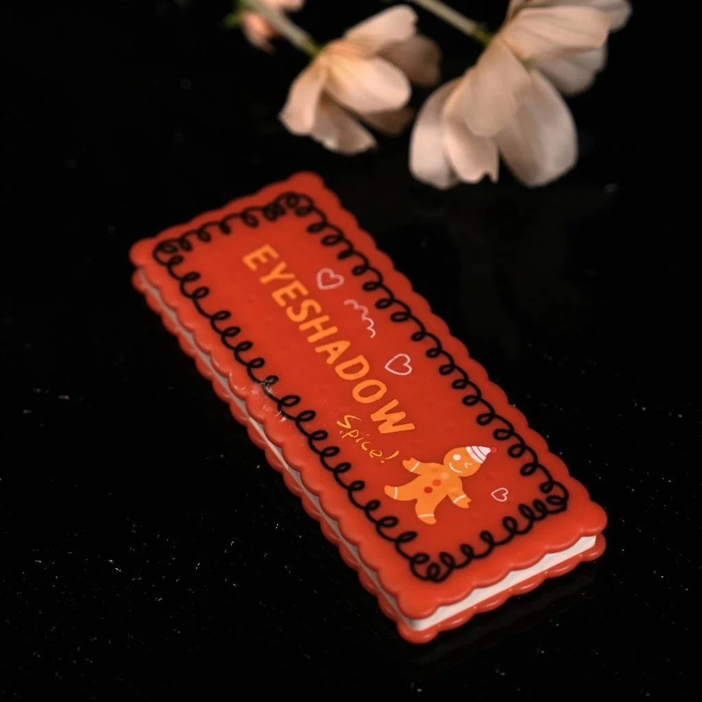
For example, an eyeshadow palette often serves as a flagship product where typography, layout, and visual balance are most visible. Clear shade names, well-spaced labeling, and a cohesive font style on an eyeshadow palette help consumers quickly understand color stories and brand positioning. Premium brands may use embossed lettering or metallic fonts on eyeshadow palettes to enhance perceived value, while minimalist brands rely on clean typography to convey simplicity and modernity.
Color Psychology in Cosmetic Packaging
Color remains a strong tool in make-up packaging. It boosts shelf notice and shapes brand plans. Items for women often use light pinks or soft shades. Top brands choose rich colors like navy or gold.
Seasonal changes in packaging keep lines new and fitting. Cool shades suit winter sets. Vivid neons work for summer ones. These match buyers’ changing moods.
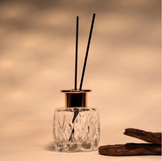
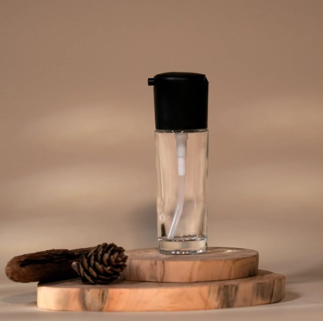
Material Selection and Tactile Experience
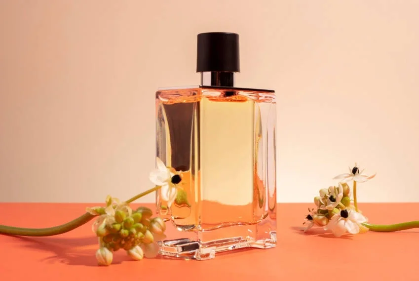
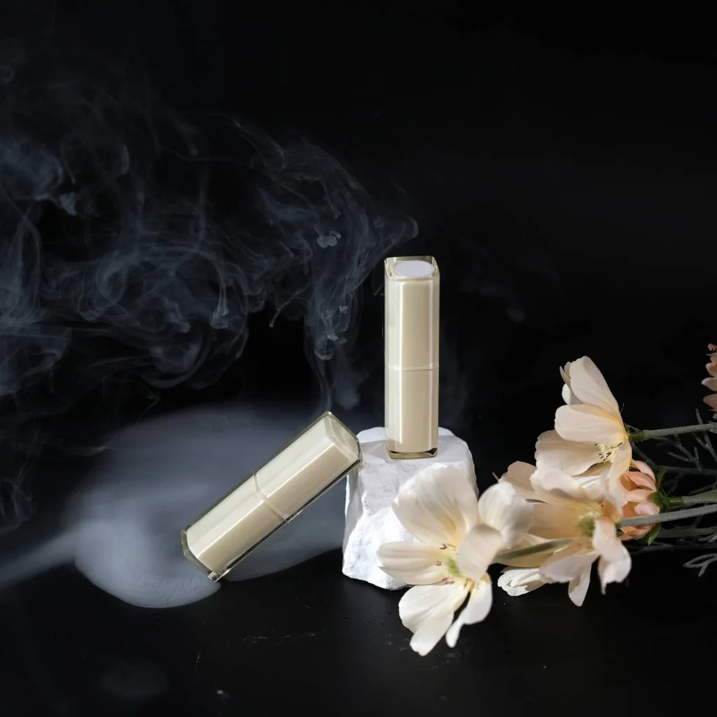
Choosing materials impacts green efforts. It also shapes how fancy a product seems. Glass raises the feel right away with its heft and touch. Made from high-quality glass, our perfume bottle from Topone Packaging is tough yet adds class to any table or shelf.
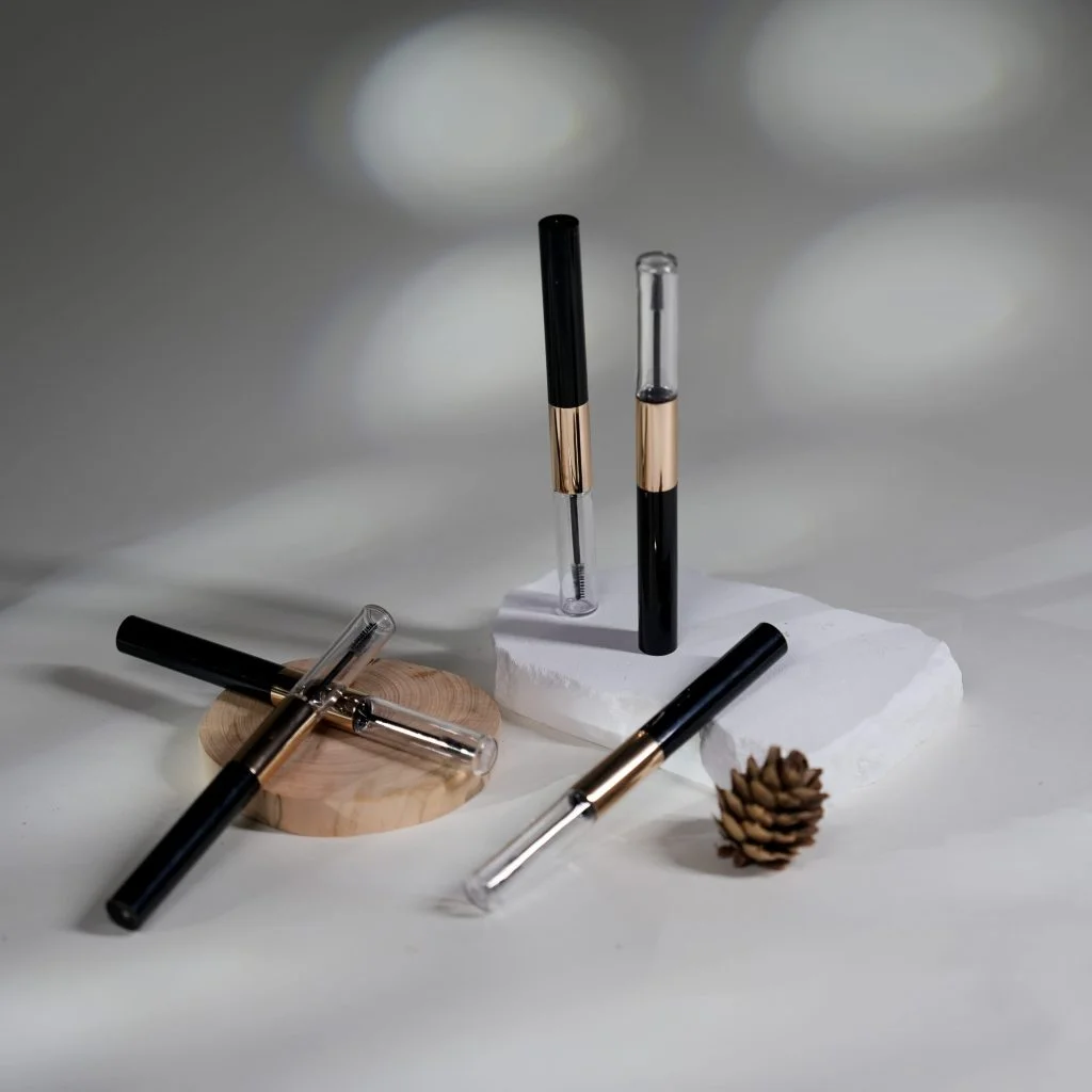
Sensory touches improve the whole experience. For example, Shantou Yuanyi Plastic created the lipstick cover chain design. It turns cosmetic wrappers into stylish add-ons.
Smooth finishes or rough textures aid handling. They also hint at top quality. These material signs let buyers judge worth in their minds before use.
Design Trends Shaping Modern Make-up Packaging
Minimalist Aesthetics in Beauty Branding
Minimalism leads in today’s beauty branding. Straight lines, lots of open space, and single-color schemes show clearness and class. This matches what buyers want: honesty and ease in ingredients and mixes.
Minimalist make-up packaging puts the spotlight on the item. It skips heavy visuals. This builds trust. It lets the product’s results stand out over extras.
Whimsical and Playful Design Elements
On the other hand, fun designs draw in young crowds who want uniqueness. Vivid hues, odd drawings, and lively forms bring joy and personal flair.
The tactile facial mask bag of Hangzhou Shencai uses frost or raised textures. These pass on a premium feel through touch memories. It proves fun can pair with high-end senses.
This style works well in special limited runs or team-ups with influencers. They aim for quick online buzz.
Luxurious Packaging for Prestige Brands
High-end beauty brands count on rich packaging to support high prices. Heavy holders, metal touches, and raised logos show rarity and top value.
Our customizable perfume glass bottle from Topone Packaging offers a great base. Crafted with care and grace, it shows how solid glass lifts how buyers view the item.
Gold leaf prints, snap-close lids, and special shapes turn make-up packaging into treasured pieces.
Innovation as a Differentiator in Make-up Packaging
Smart Features in Cosmetic Containers
Today’s buyers seek more than looks. They need real use. Smart traits like stackable holders allow easy carry without losing style.
Yushu Packaging suggests viewing consumer big data for new material peaks. They refine designs with real-world info. This leads to fresh ideas like color-shift wrappers or user-friendly shapes based on feedback.
Customization and Personalization Options
Customization is now a must. Buyers expect it. Custom lipstick cases or marked perfume bottles add feeling value. They build brand closeness.
With choices for personal marks, tags, and extras, you can make a bottle that fits your scent. It also shares its special story.
This kind of tailoring aids team-ups with influencers. It supports small-market plans by making each item seem one-of-a-kind.
Sustainability as a Competitive Advantage in Packaging Design
Eco-Friendly Materials Without Compromising Style
Buyers care more about the planet now. Brands must use green ways without losing appeal.
Green efforts form a main part of the packaging field. They seek ways to cut carbon from materials and designs to reuse.
For example, lighter tubes and swap-out vacuum bottles from Topone Packaging offer many refill options. They fix issues with old pump heads that are hard to take apart.
These steps show green choices can match luxury if done right.
Communicating Sustainability Through Design Language
Green messages need strong visual support. Natural shades, rough paper feels, or simple tags share eco-values well. Clear info on reuse or source builds faith in green-minded shoppers.
Glass is a green and reusable material. It suits careful buyers and firms.
Biodegradable or refill setups strengthen earth care and brand truth.
Gender-Inclusive Approaches in Make-up Packaging Design
Neutral Aesthetics That Appeal Across Genders
As views on gender change, cosmetic packaging must follow. Skipping strong gender hints like pinks or flowers opens items to more people. Plain colors with basic shapes help cross old divides.
This move shows a welcoming view. It prizes personal traits over old ideas.
Inclusive Branding Through Visual Language
Pictures and words should show varied gender types. Gender-free designs with open language signal forward thinking.
New brand starts skip wide channel growth. They mix tech and human sides. Thus, they link well to buyer markets.
Make-up packaging that welcomes variety is not just ahead. It makes smart business sense in our aware world.
FAQ
Q: Why is make-up packaging so important for buyer perception?
A: Make-up packaging creates the first impression of a cosmetic product and strongly influences how consumers perceive quality, value, and brand identity. Visual elements such as color, typography, shape, and material can trigger emotional responses that directly affect purchase decisions.
Q: How does make-up packaging design influence purchasing decisions?
A:Well-designed make-up packaging communicates brand values, enhances shelf appeal, and builds emotional connections with consumers. Eye-catching and thoughtful packaging increases perceived product performance and encourages impulse buying, especially in competitive retail environments.
Q: What trends are shaping modern make-up packaging design?
A: Current make-up packaging trends include minimalist aesthetics, sustainable materials, customization, smart functional features, and gender-inclusive design. These trends help brands meet evolving consumer expectations while strengthening differentiation and brand loyalty.